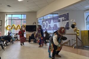
Nest announces new logo

The Iakwahwatsiratátie Language Nest has used its first logo proudly since it opened its doors in 2014, an illustration made by local artist and then-participant Megan Kanerahtenha:wi Whyte.
But as the organization celebrates more than a decade of operations, they’ve ushered in a brand-new visual identity, with a sleek, refined logo created collaboratively with local designers and leadership.
“(Whyte) created that logo on the fly based on the concept of the Nest, and we’re so grateful that she did that for us, but we figured now that we’re grounded, now that we have our funding, we can sit and put in our thoughts and come to one mind about what we want in a logo,” said Karihwakatste Deer, coordinator at the Language Nest.
The new logo was designed with the help of artist Jada Hopper, as well as Hopper’s brother, Ikerson Hopper, of Hopper Designs.

It features figures holding hands, representing the “circle of security” and generations protecting the children, represented by the central child figure in a cradleboard. The illustration is bordered by a sweetgrass braid.
“That represents the generations coming together to create a tight weave, holding the language together and bringing it into the future,” Deer said.
“There’s a lot of meaning and representation in the details we’ve come up with.”
She said she’s delighted that Iakwahwatsiratátie can represent itself with the new logo.


“When I look back at everything we’ve been through and how much we’ve grown, everything works out the way it should,” she said. “The number one thing that has always helped us move forward is having the community behind us.”